
Spotty coverage is a common WiFi problem that frustrates many IT professionals.
With so many variables that can affect WiFi coverage, such as building materials, building dimensions, interior objects (i.e., furniture), and the types of devices and applications that will be in use, without the help of a WiFi heat map, it can be difficult for even seasoned network engineers to sort out.
WiFi heat maps can help you avoid coverage problems (and help with other WiFi performance issues). Understanding them can make all the difference when it comes to optimizing WiFi performance.
In this guide, you'll learn:
- What a WiFi heat map is
- What types of heat maps are there
- Why it's so important to use a WiFi heat map
- How WiFi heat maps work
- What the essential components are to get started
- What is the most common WiFi heatmapping software available?
What is a WiFi Heat Map?
A WiFi heat map is a visual representation of the invisible wireless signals that are used to deliver WiFi. The WiFi heat map is produced using specialized software to visualize RF coverage within a given space.
In simple terms, the WiFi heat map will show the signal strength and quality throughout a space to verify that the WiFi design is effective and optimal to support the use of wireless devices and applications.
Currently, the WiFi heat map will simultaneously show signal strength and quality for both of the WiFi radio bands or frequency spectrums that the FCC has allowed for unlicensed use. The radio bands that WiFi currently uses occupy the 2.4Ghz and 5Ghz frequencies.
However, with the FCC's recent announcement of the 6GHz spectrum opening to unlicensed WiFi use, the capabilities to improve available WiFi bandwidth, coverage, and overall performance will increase dramatically over the coming years.
To put it in perspective, here is what we work with today when designing, installing, and supporting WiFi networks.
We currently have two frequency spectrums to work with, 2.4 & 5GHz. Within these spectrums, we have a limited number of channels or bandwidth, and here is how it breaks down:
- 2.4GHz = 3 channels for 60MHz of bandwidth
- 5GHz = 25 channels for 500MHz of bandwidth. (*Note – some of these channels aren't supported by all consumer WiFi devices, and some even interfere with doppler radar. This does reduce total available bandwidth for some WiFi installations)
With the future introduction of the 6GHz frequency spectrum we will have;
- 6GHz = 59 channels for 1200MHz of bandwidth.
In other words, our WiFi designs are about to get a lot more interesting—and awesome.
Different Types of WiFi Heat Maps
The heatmap you're probably familiar with measures a wireless network's most basic requirement called signal strength or coverage.
WiFi designs are done to accommodate the lowest performing devices (phones & tablets) with as optimal signal strength as possible.
This can potentially increase the required AP count in comparison with designs that are done for higher performing devices such as laptops.
WiFi is a two-way communication process and as such, access point power levels need to be symmetrical with client device power levels for matched TX/RX.
However, you can perform several other measurements to produce different types of heatmaps.
These tests can include:
- Signal to Noise Ratio (SNR) - Indicates how much the signal strength is greater than the noise floor (co-channel interference) found in a particular space.
- Channel Overlap - Shows the number of access points audible at each location using the same channel.
- Data Rate - The highest possible speed (measured in megabits per second) wireless devices will be transmitting data. Typically, the actual data throughput is about half of the data rate or less.
- Throughput (Max) - Displays the estimated maximum effective throughput. Throughput is dependent on environmental RF factors such as interference, client density, other wireless networks, channel contention, and additional WiFi overhead. Typically, data throughput is about half of the data rate or less due to the half-duplex nature of wireless.
- Spectrum Utilization - Shows the share of time the spectrum power is high enough so that the channel appears as occupied.
- Spectrum Channel Power - Displays the average total energy (the max value over all channels). The energy includes both WiFi and non-WiFi signals.
- Network Health - Typically, we deploy WiFi for a specific purpose or several purposes, such as VoIP, web browsing, or location tracking. With Network Health, you can, with a single visualization, display whether the network meets your requirements or not.
- Network Issues - Network Issues complements Network Health by showing the requirement(s) below each location's threshold level. Whereas Network Health answers the question, "Does it work?" Network Issues answers the question, "If it doesn't work, why?".
- Access Point Roaming Zones – This test measures the efficiency of a wireless client device roaming from access point to access point. Each access point creates a broadcast zone (cell) where wireless client devices within that zone (cell) should maintain a consistent connection to that access point. As the wireless client device roams outside of that zone (cell), it should drop the connection to the previous access point and connect to the next access point in the new zone. This measurement will visualize how effectively or not your WiFi system is handling this process.
- Packet Loss – All data on the network is made up of packets, and when a packet or multiple packets are lost, it causes a domino effect that impacts overall performance. Measuring this process's effectiveness and efficiency is critical in understanding how your WiFi system is actually performing. The packet loss measurement will visualize where in your environment packet loss is happening, which is key to uncovering the root cause in poor performance behaviors on your WiFi system.
- Round Trip Time – Optimal wireless performance is dependent on the time it takes to deliver and receive data packets. The round trip time test measures this as the assessment is being conducted and visualizes on the heatmaps where high latency (slowness) occurs on your wireless system. Like packet loss, this is a valuable insight into where your wireless system's potential inefficiencies are happening and provide insight into possible root causes.
At SecurEdge, we offer both predictive design and WiFi performance assessment services that feature all of the heatmaps mentioned above.
Why Do You Need a WiFi Heat Map?
Both IT professionals and network engineers rely on WiFi heatmaps to accomplish two main objectives, plan for the deployment of a new wireless network or fix and optimize an existing system.
This type of visualization and testing allows them to perform many critical tasks to achieve the best possible user experience. This includes:
- Plan access point placement
- Create channel and power plans
- Tune and adjust the system configuration
- Identify areas with signal deficiency
- Locate and identify sources of interference
- Uncover potential rogue devices
Not using a heatmap means your system is being designed by guessing, and while we have over 15 years of experience designing WiFi networks, even we wouldn't be able to do that—so let's stick to what works.
How Does a WiFi Heat Map Work?
We have discussed the importance of a heatmap, but how does WiFi heat mapping software actually work?
Heatmapping software works by methodically capturing and recording the signal levels of your access points at intervals as a survey engineer walks your site with a device to record these measurements.
After the survey, a report is generated that displays each access point's performance by visualizing a color on the screen that correlates with signal strength or another measurement, as we have outlined above.
In general, green represents optimal signal strength, yellow is weaker but okay, and red is the lowest—not what you're looking for. Respectively, all the colors in between will give you indications of the in-between strengths as well.
However, there are different types of maps, depending on which test you are performing. The specific test being performed and the type of software being used will affect how each map looks, but below are several examples of what you can expect. *Note: these maps were created using Ekahau software.
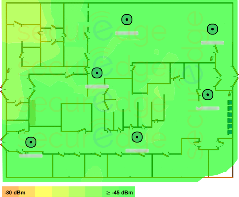
Signal Strength
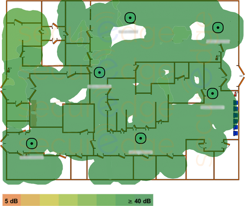
SNR
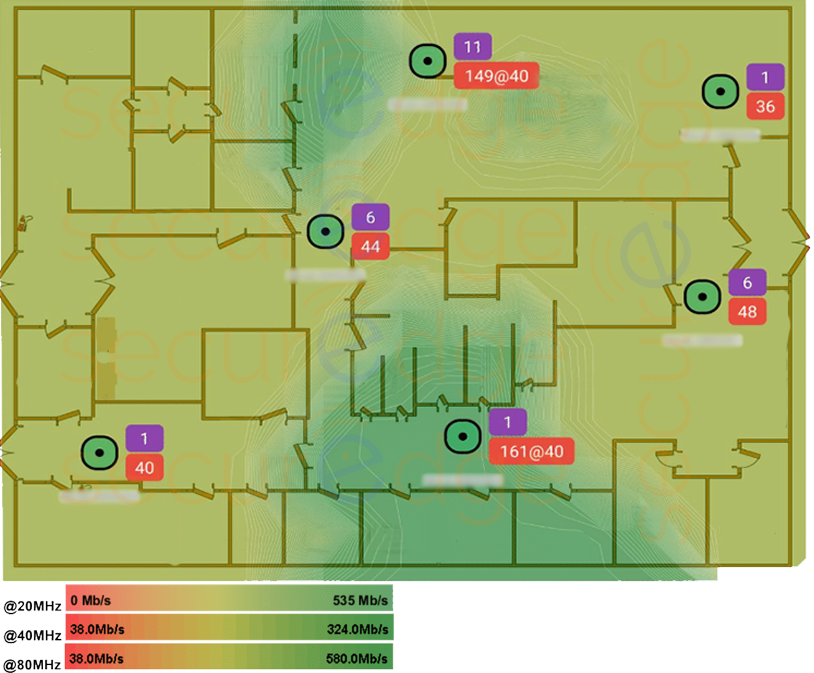
Throughput (Max)
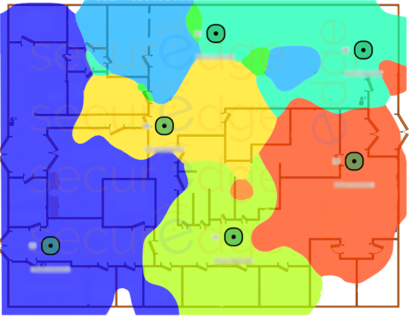
Access Point Roaming Zones
There are two different ways to generate a heatmap. The first way involves using predictive design software, a computer, detailed information about the building/location, and ideally floorplans.
The second way expands on the first by having an engineer visit the specific building or site to validate the software-based results in the real-world environment.
When on-site, the engineer will walk around your building or site carrying a laptop or tablet loaded with wireless survey software to collect your wireless system's performance metrics and gather the data to generate the heatmaps.
This is your first step in achieving better coverage, productivity, reliability, and a more enjoyable user experience for everyone at your business.
How to Get Started
Here's what you'll need to build your own WiFi heat map, you will need the following:
- A desktop, laptop, or tablet (laptops or tablets are required if in the field)
- WiFi heatmap software
- Detailed information about the building, applications, and devices being used
- Floor plans of the building
Common WiFi Heatmapping Software
There are many companies out there that create heat mapping software, and they all have things that make them unique.
Here are a few top companies (in no particular order):
- Ekahau (a standard amongst WLAN professionals and the software used by SecurEdge engineers)
When it's time for you to choose a heat mapping software, you will have your pick of the combinations of features that you need in the price range that is right for your business. And while we are not here to tell you which one to choose, we do have some factors you should consider:
- Ease of use
- Compatibility
- Price
- Features
It's important to note that some of the software requires a specific certification to operate, which adds additional cost and time to your project.
You Can Always Just Leave it to the Experts
Although there is a lot of excellent software that helps make it easy, WiFi is both an art and a science, so it requires not only the necessary technical certifications but extensive expertise to generate the optimal results.
Even many of the largest organizations don't have in-house staff with the specific WiFi expertise needed to create an accurate heatmap or design—the costs and time investments are too high for most.
At SecurEdge, our certified network engineers have produced thousands of heatmaps, using the latest software available, and we're ready to be a resource for your business.